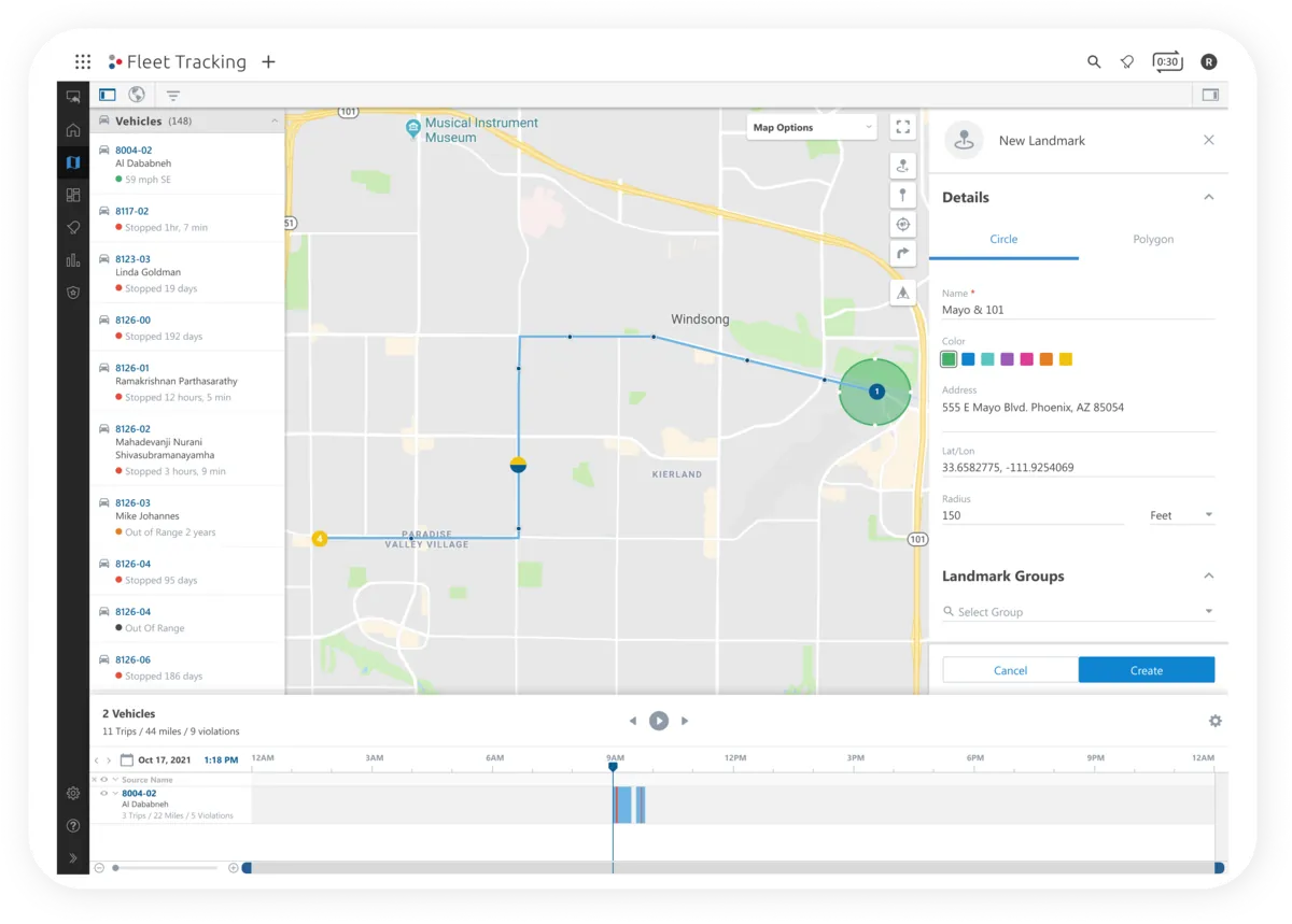
I was the primary designer leading this project in Q3–Q4 2021: early discovery & concepts, regular presentations to leadership & subject matter experts, & final designs for production.
I worked with two product managers, a team of engineers, & people from account management, user onboarding & sales engineering.
- Primary designer, Q3–Q4 2021
- 2 product managers, engineers, account management, onboarding & sales engineering
- GPS Insight, fleet telematics SaaS
- Fleet managers
Project summary
GPS Insight helps businesses track & manage their assets. Customers connect our hardware to their vehicles, & our SaaS platform turns what it records into data they can act on.
The activity feed was part of a large project to bring the outdated “legacy” platform into our new portal, so customers could do everything they need without the old one.
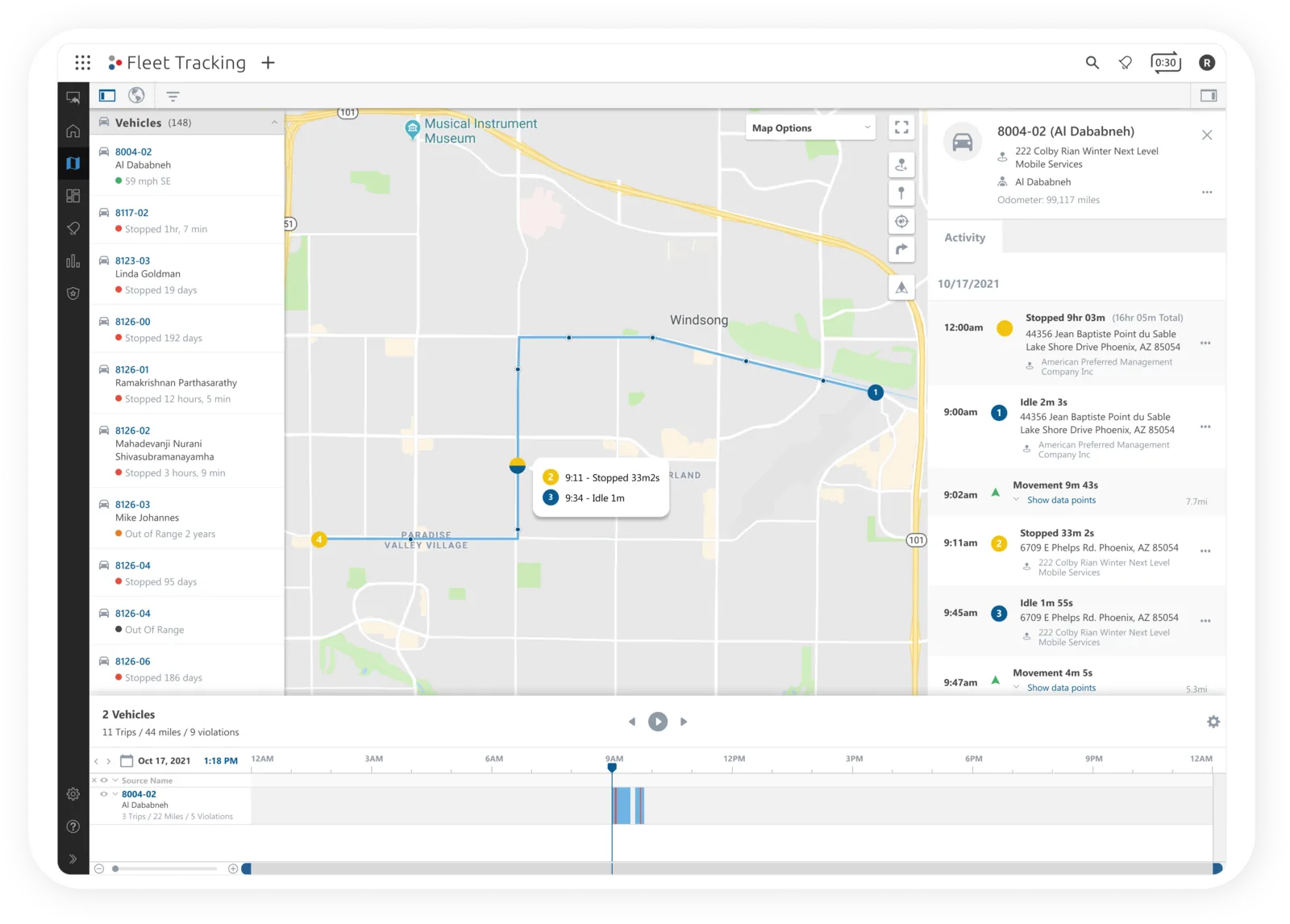
It shows the history of movement for a vehicle or asset, a trailer or a bobcat. A fleet manager uses it to follow up on customer complaints, accidents & incidents, or anything else about where a vehicle has been & when.
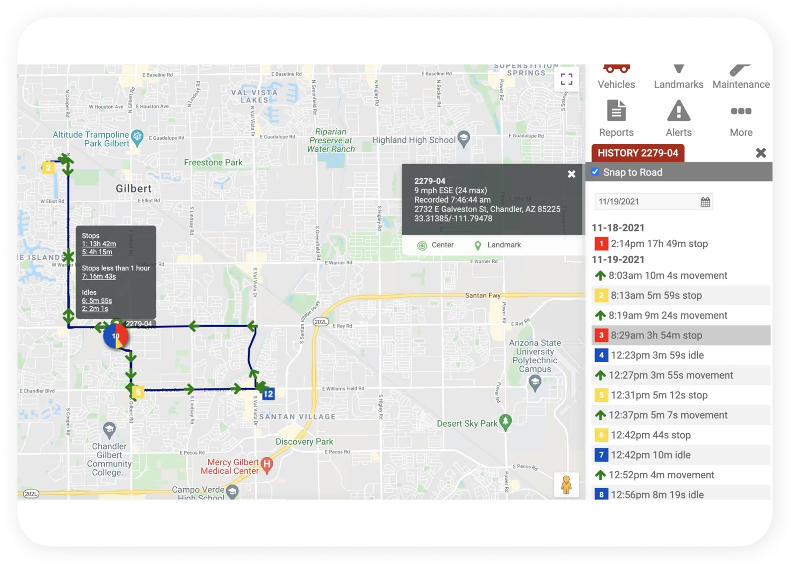
Discovery
I wanted to answer these questions:
- What can the activity feed in the old portal do?
- What are the common use cases? The edge cases?
- Who is using it?
- How could it improve?
- What information matters most to someone reading the feed?
Key takeaways
I interviewed stakeholders across product, account management, solution engineering & software engineering. Their answers defined the problem:
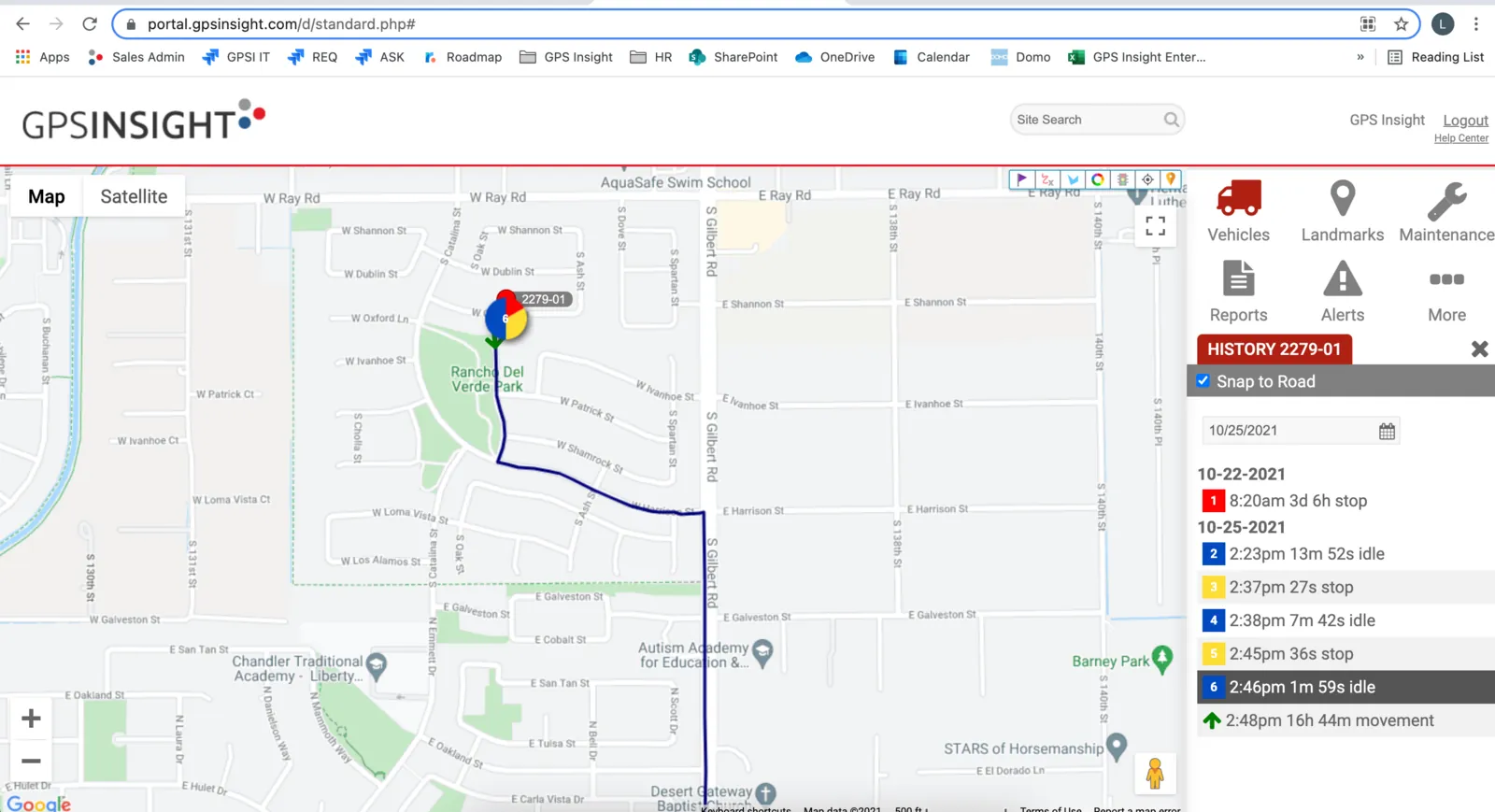
Users struggle to find the insight they need to make decisions because of the layout & format.
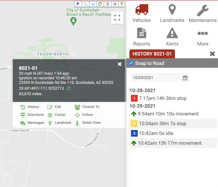
Users cannot tell what happened when many points are logged close together.
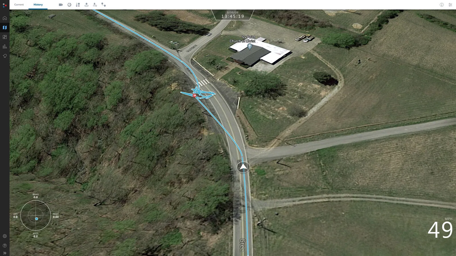
Users need to know what type of event happened at a given point.
User insights
I turned the research into insight, need, point-of-view & how-might-we statements.
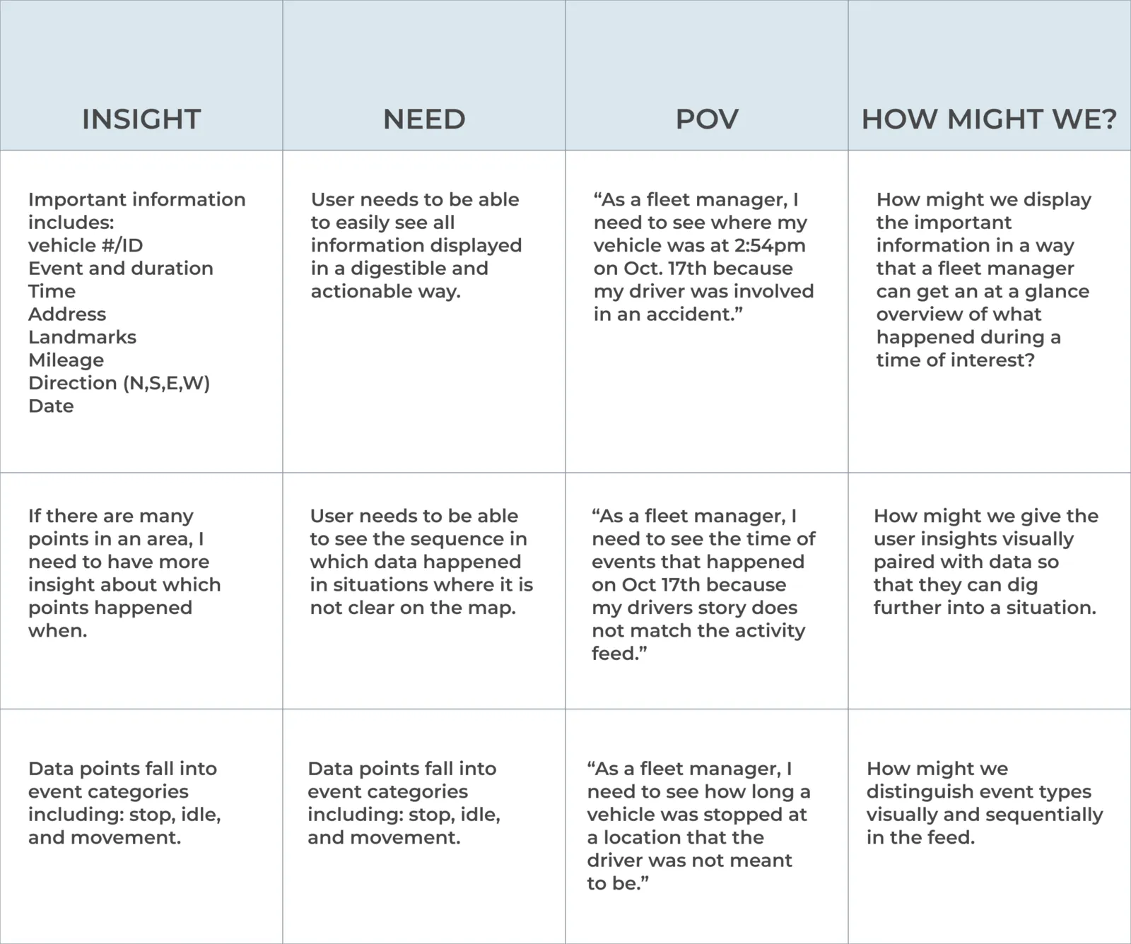
How might we
How might we show the important information so a fleet manager gets an at-a-glance view of what happened during a time of interest?
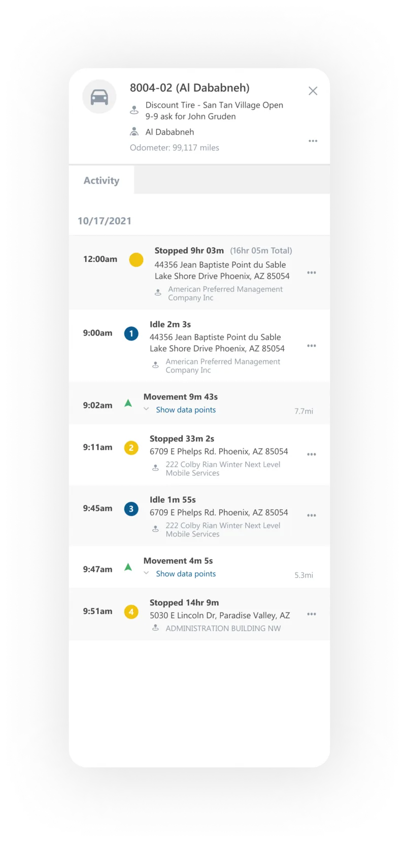
- Correlate events on the map with the feed using color, sequential numbering, selection states & a map pin.
- Use visual navigation guides to show the direction a vehicle was travelling at each data point.
How might we pair visual insight with data so the user can dig further into a situation?
- Connect timestamps to the map pin so the user understands the context of what took place.
How might we distinguish event types visually & in sequence in the feed?
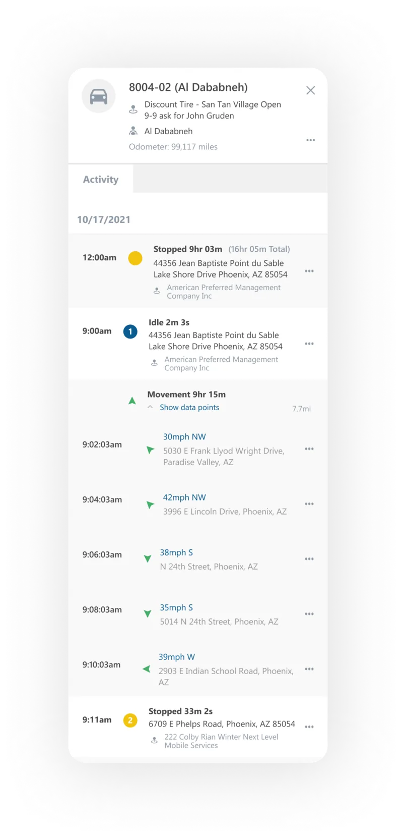
- Let the user expand & collapse movement segments to see the individual data points recorded during a trip.
User goals
Visual definition
The map & the feed correlate visually.
Control over data
Progressive disclosure keeps cognitive load down.
Streamlined workflows
Tasks happen without leaving the map or the feed.
Visual definition
- The feed matches the map visually & numerically.
- Each data point is clearly defined.
- Selecting points shows where they fall in sequence & in time.
- The map, the feed & the timeline agree, giving several views of what happened.
Control over data
Progressive disclosure prevents overload. In the old design you could not drill into a data point. Now you see the overall event & can research an asset’s movement point by point.
Streamlined workflow
- The right drawer becomes a workspace for finishing tasks without leaving the flow.
- Success messages link back to the feed you were reading.
- The map history & the timeline are always within reach.