Guests heavily tap the category bubcats & the “All Categories” entry point in target.com’s mobile slideout menu, but the experience was list-heavy & not built for quick wayfinding. The brief: improve efficiency without rebuilding the entire navigation at once.
I explored four ways to reach a category from the menu. They were tested in market against the current experience, & one clearly won. It is now the foundation for the next test.
- Senior UX designer, category navigation
- target.com, mobile-web slideout menu
- Click analytics, then 4 variants tested in market
- +1.07% cart add rate, the only statistically significant cart lift
What the data said
Guests are in a “get me to the right department” mindset.
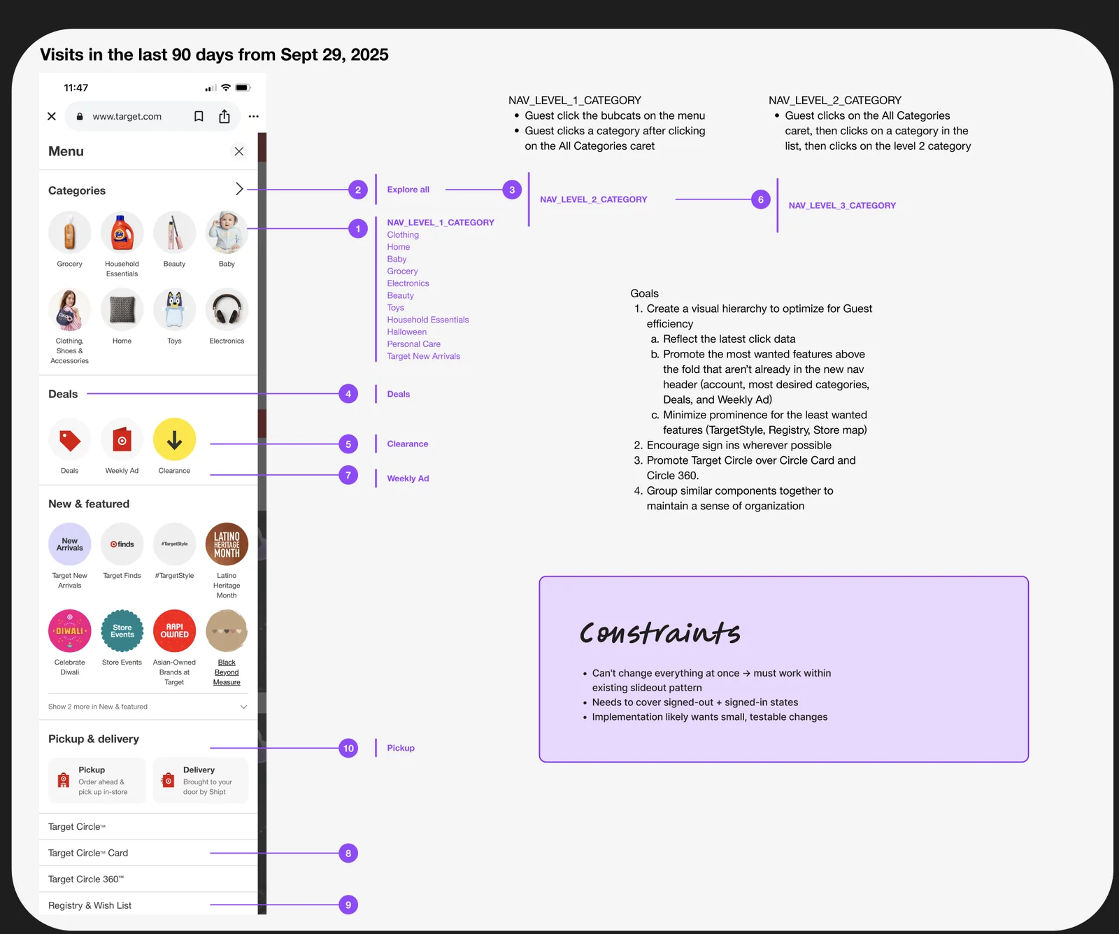
Analytics on the menu’s last 90 days pointed the same way:
- The #1 click target: level 1 category bubcats.
- The #2 click target: the “All Categories” chevron.
Visits in the last 90 days, from Sept 29, 2025
Every menu item, numbered by how often guests tapped it, with the path each tap took.
Goals
- Create a visual hierarchy that optimizes for guest efficiency: reflect the latest click data, promote the most-wanted features not already in the new header (account, top categories, Deals & Weekly Ad), & minimize the least-wanted (TargetStyle, Registry, Store map).
- Encourage sign-ins wherever possible.
- Promote Target Circle over Circle Card & Circle 360.
- Group similar components together to keep a sense of organization.
Constraints
Inside the slideout
We couldn’t change everything at once, so every idea had to work within the existing slideout pattern.
Two states
Every design covers signed-out & signed-in guests.
Small & testable
Implementation favored small changes we could test in market.
Four variations
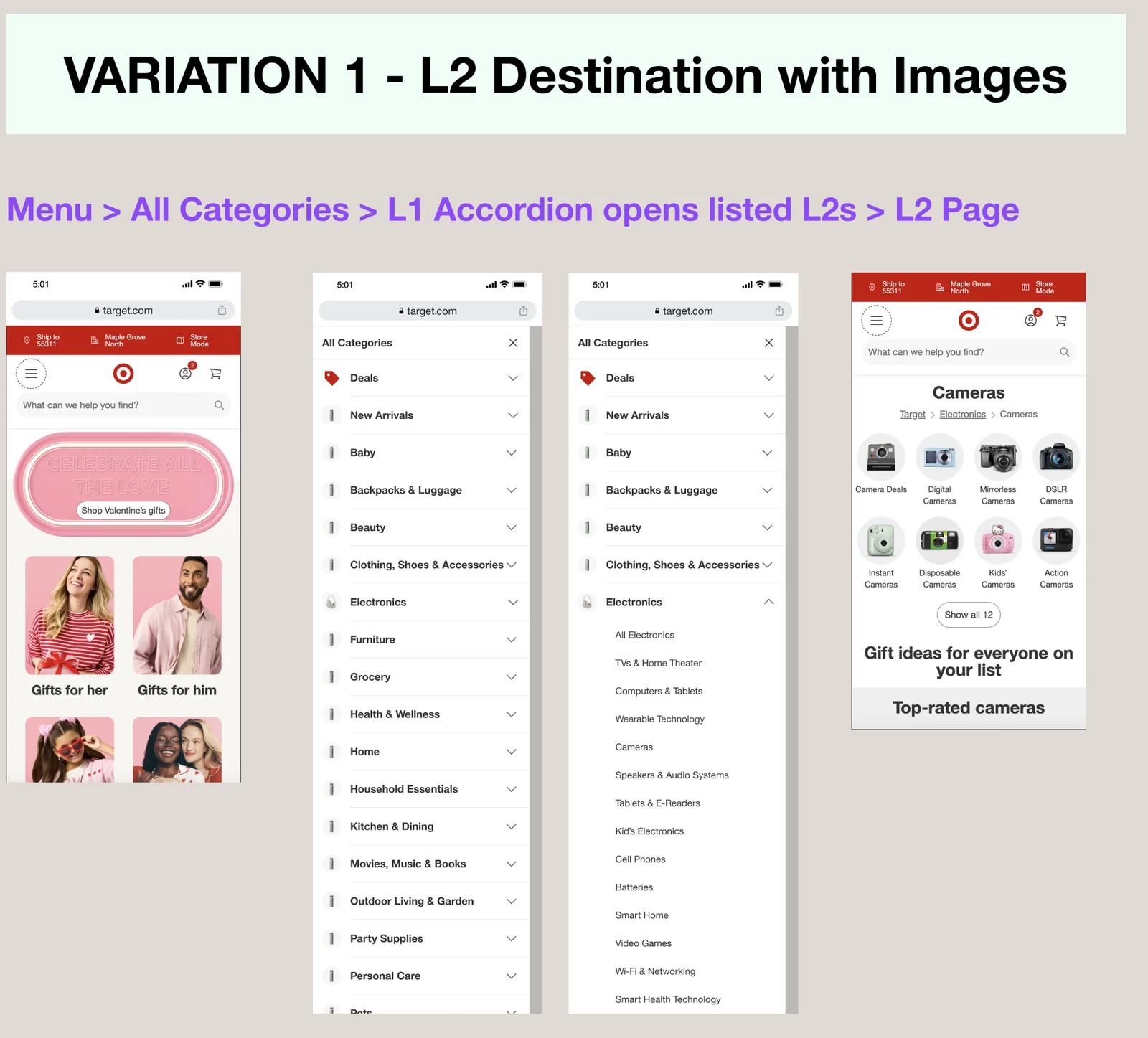
Two questions, crossed: should a category open in place as an accordion or send guests to a category page, & should the rows carry images?
V1 · L2 destination with images. An L1 accordion opens its L2s in place. 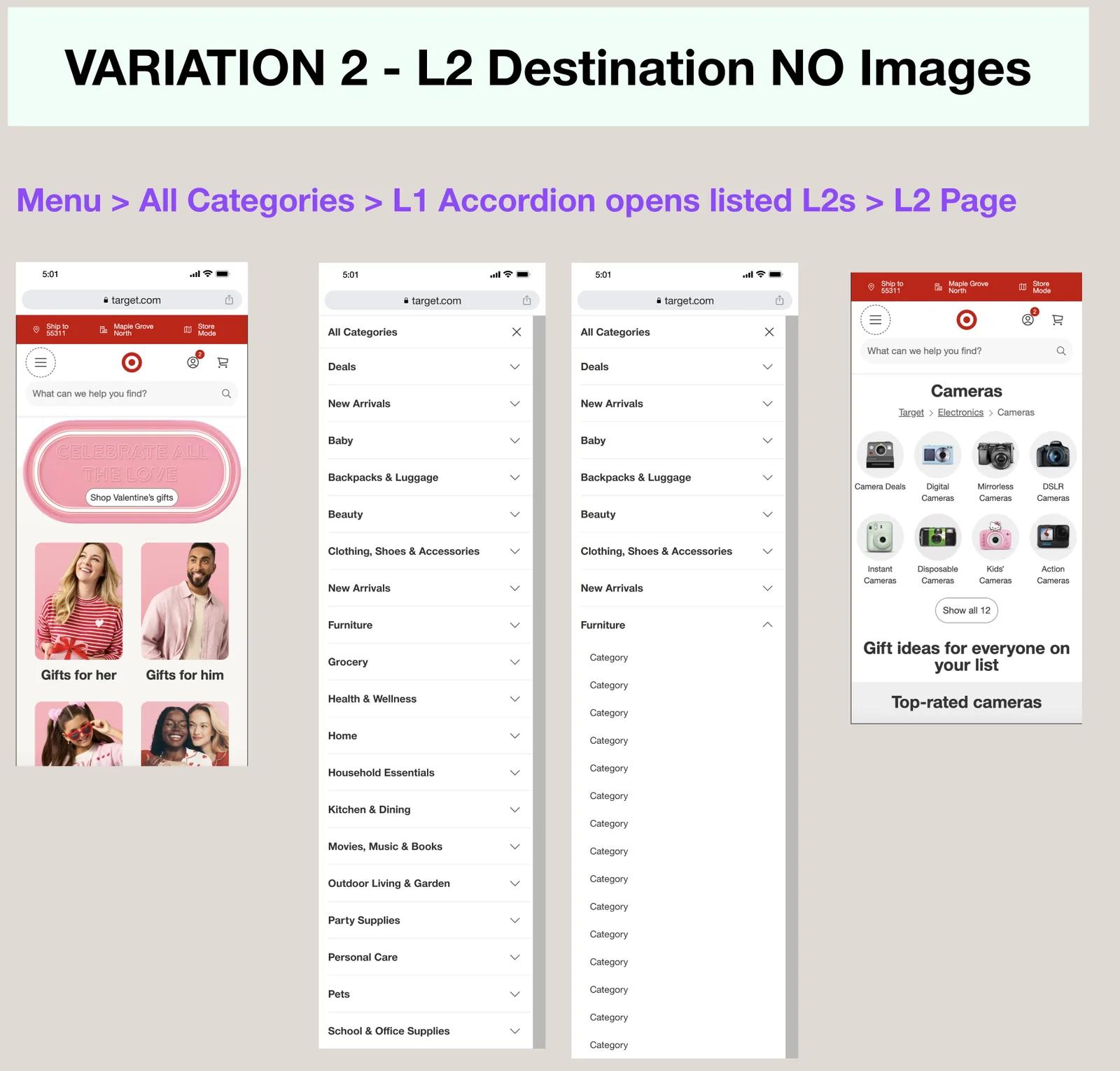
V2 · L2 destination, no images. 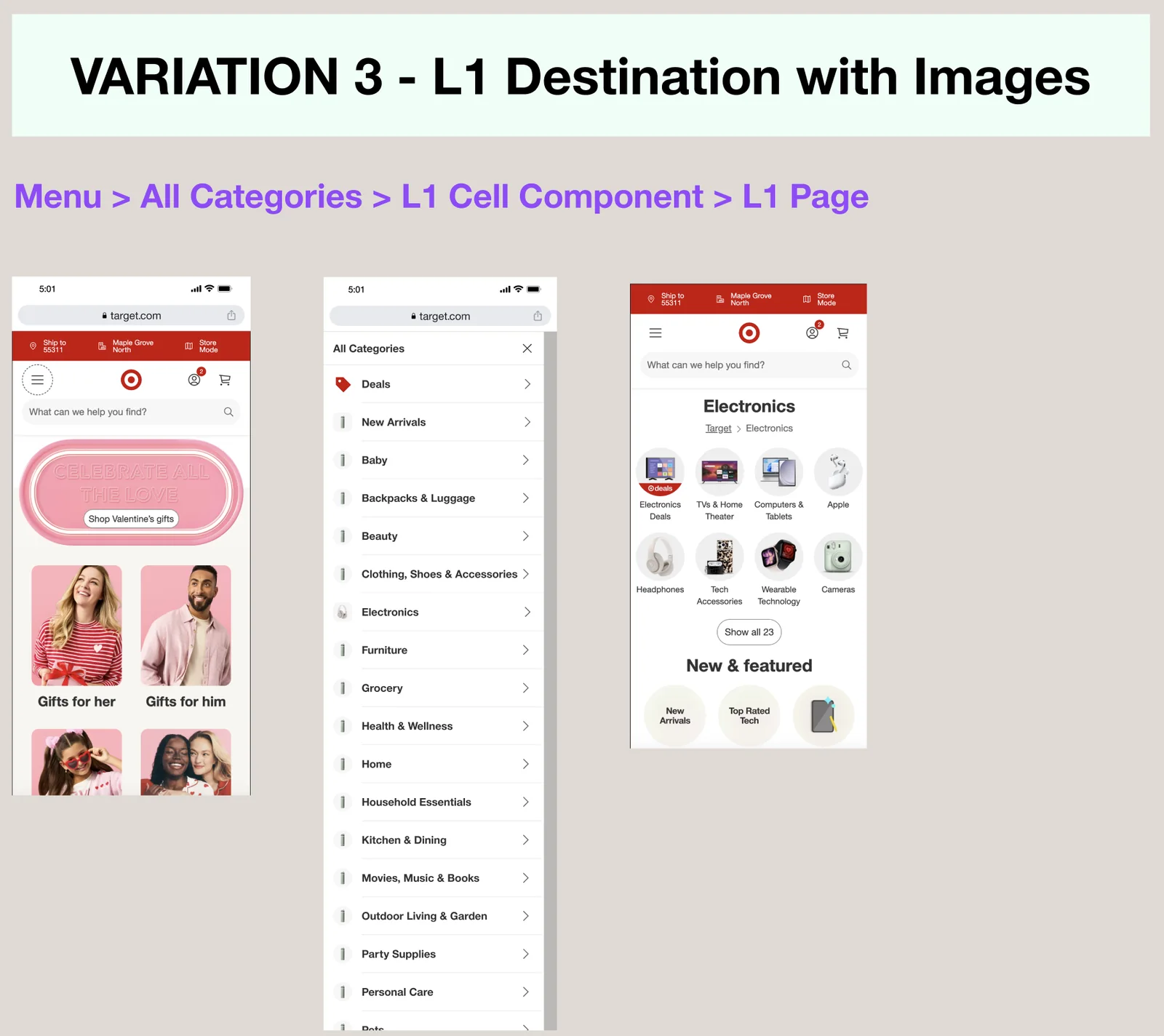
V3 · L1 destination with images. Each L1 row goes to an L1 page. 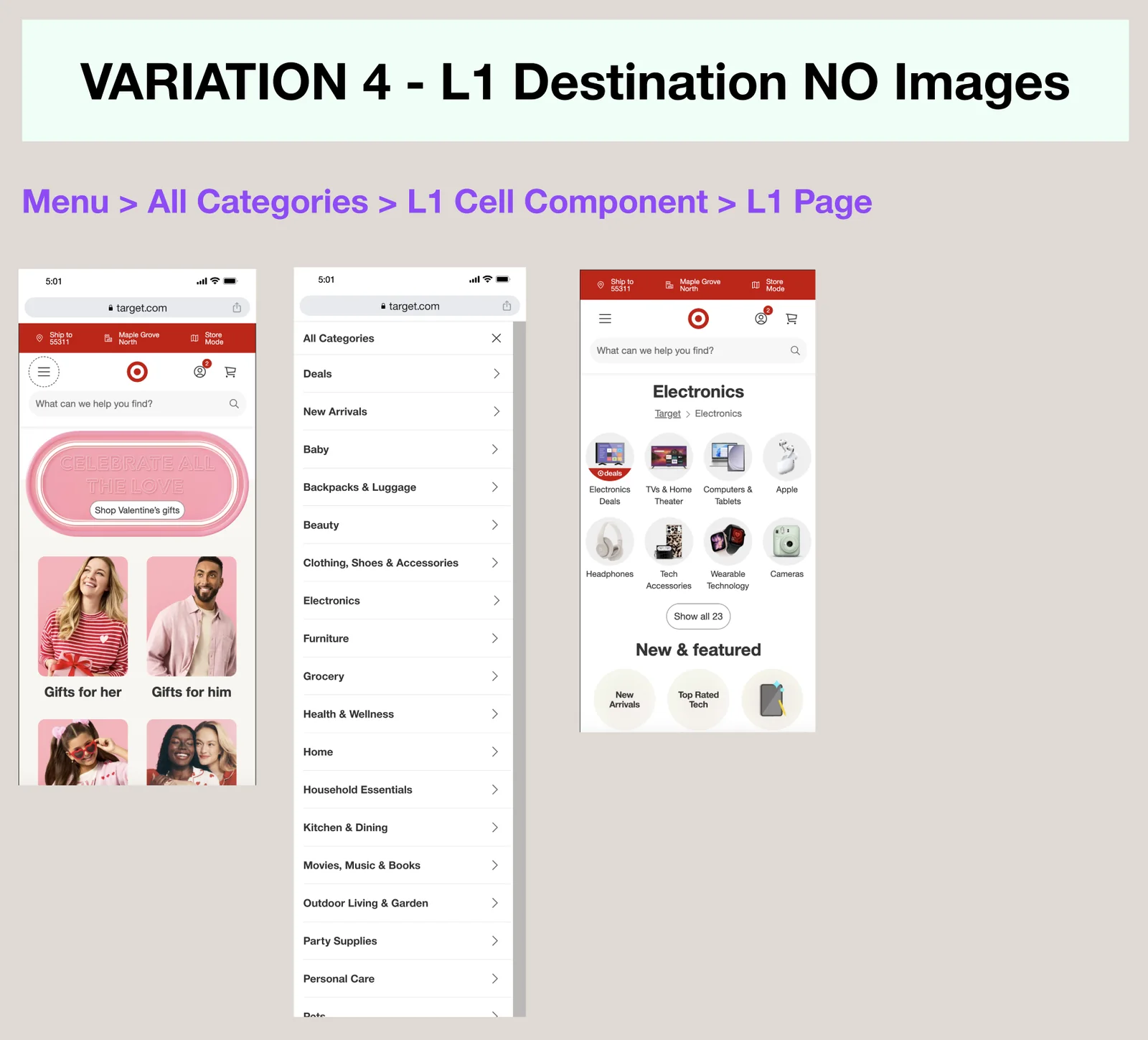
V4 · L1 destination, no images.
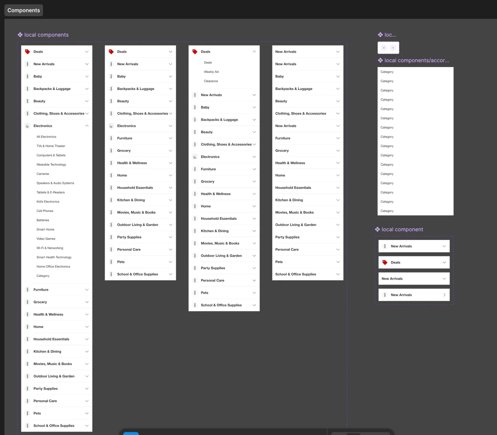
Components
The menu rows & accordions, built as local components so each variation drew from the same parts.
Results
Variation 1 won.
- Category page visit rate
- +5.74%Category page visit rate
- Cart add rate
- +1.07%Cart add rate
- Merch visits rate
- +1.45%Merch visits rate
- Menu click-through to category, deals & weekly ad pages
- +7.82%Menu click-through to category, deals & weekly ad pages
- Every variant increased accordion engagement, confirming guests use the expanded category menu.
- V1 drove a statistically significant lift in category page visits & was the only variant with a statistically significant cart add lift.
- V3 drove the most category, deals & weekly ad traffic, but weaker downstream quality, with PDP & cart add declines.
- V1 also kept better funnel quality, with directional lifts in nav-driven product page views (+1.17%) & average order value (+2.10%).
What’s next
Fewer, broader choices, without losing the accordion.
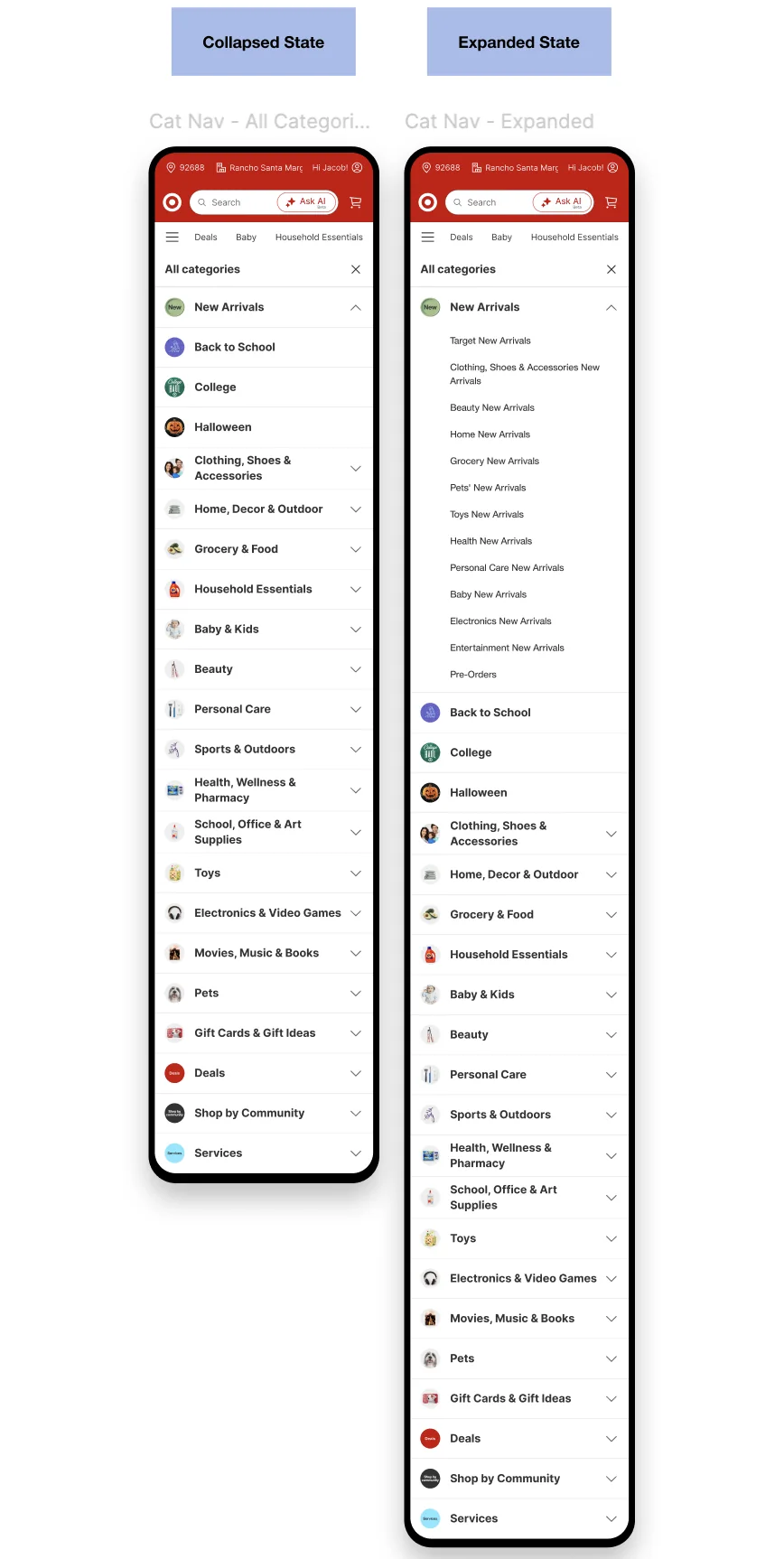
The next test adds a guest-facing L0 layer above the category structure, consolidating 28 exposed navigation items into 20 broader clusters. The hypothesis: less choice up front makes the menu easier to scan & helps guests find the right part of the catalog.
The risk is that broader labels add ambiguity & an extra step. Since the first test showed guests benefit from seeing lower-level choices before committing to a broad page, the design keeps the accordion, exposes high-value destinations inside each L0, & has destination pages lead with subcategory navigation.
- First-click success & path directness
- Time & taps to a relevant product list or product page
- Wrong turns, backtracking & repeated menu opens
- Falling back to search after using the menu
- Product page reach, add to cart, conversion & revenue
L0 category navigation
Home, All categories, an expanded L0, then the Cameras L2, as prototyped for the test.
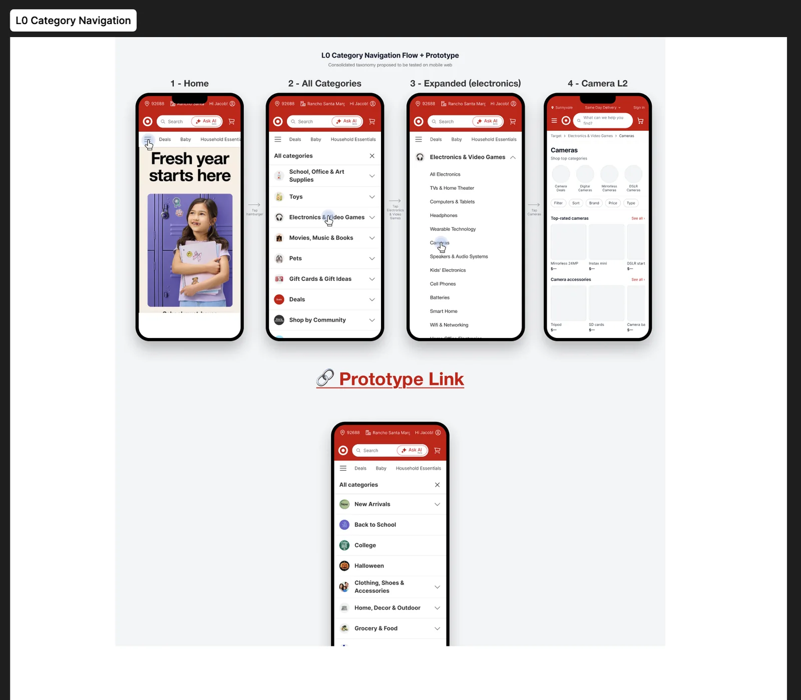
Collapsed & expanded