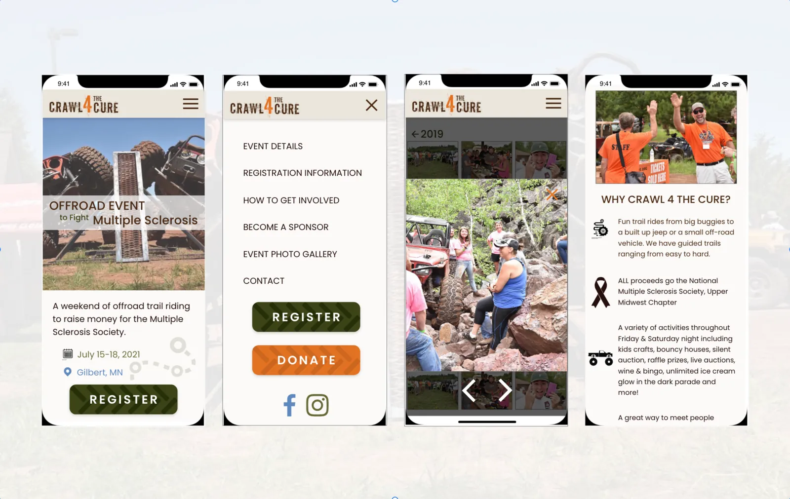
Crawl 4 the Cure is a non-profit event that donates 100% of its proceeds to the National Multiple Sclerosis Society, Upper Midwest Chapter. This was a mobile-first redesign of its website. The original was hard to navigate & did not respond between devices.
- Research, interviews, flows, IA, wireframes, prototype, UI & testing
- Empathize · Define · Ideate · Prototype · Test · UI
- Group project, UX/UI program
- 2020
The challenge
The original site did not clearly answer what, when, where, how, why & who, & it did not work on smaller screens. For an event that depends on online registration, the site had to lead people toward registering.
We wanted information that is easy to take in, & a mobile experience just as lovely as desktop. We hoped to see more sign-ups & a lower bounce rate.
Research
Our group ran one-on-one interviews & a Google survey shared on Facebook & Instagram, plus a competitor analysis. An affinity diagram & an empathy map gave us three takeaways:
- People want to know the event is legitimate & supports MS in a meaningful way before they commit.
- Many people research events on their phones.
- People are more likely to attend on a friend’s recommendation, or for a cause that touches them personally.
Problem statement
Visitors struggle to find what they need, especially on a phone. Inconsistency between devices & scattered information were driving people away, & with them, participation.
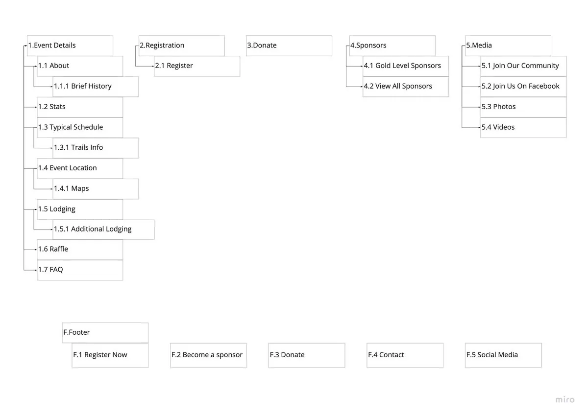
Site map
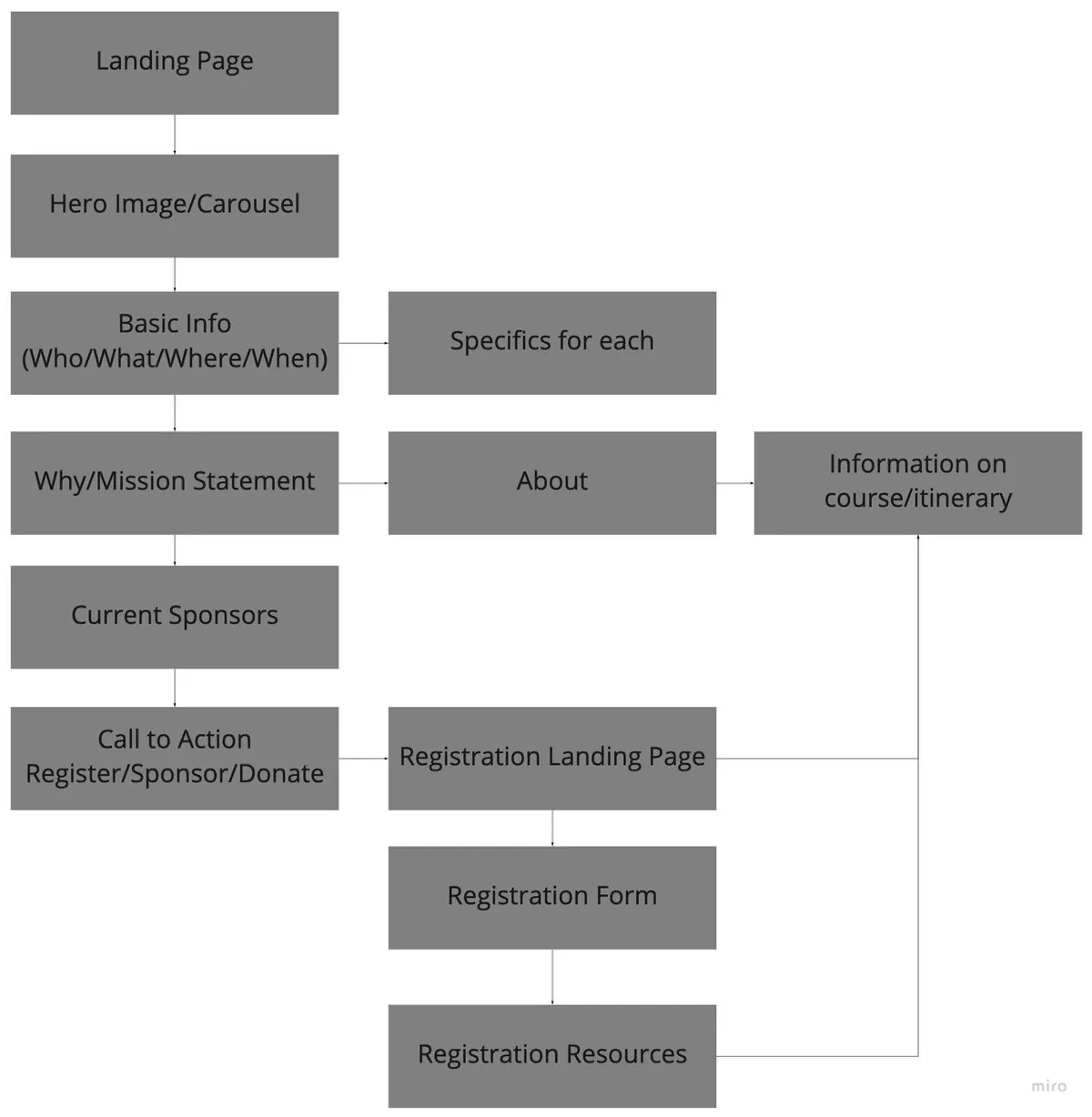
User flow
Testing
I ran three tests of four tasks each, to make every action step more intuitive:
- Find the schedule of events.
- Register & complete payment.
- Become a sponsor.
- Ask a question through the contact form.
Hi-fi prototype
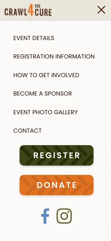
Poppins for readability, tire-mark button accents & off-road watermarks for fun, earth tones & the MS Society’s orange.


Conclusion
The new layout makes the important information easy to take in & the site easy to move through. Bright, friendly calls to action, collapsible sections for the FAQ, & most importantly a registration that is simple & quick.
Next: the desktop version, then front-end development.